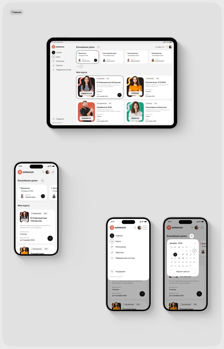
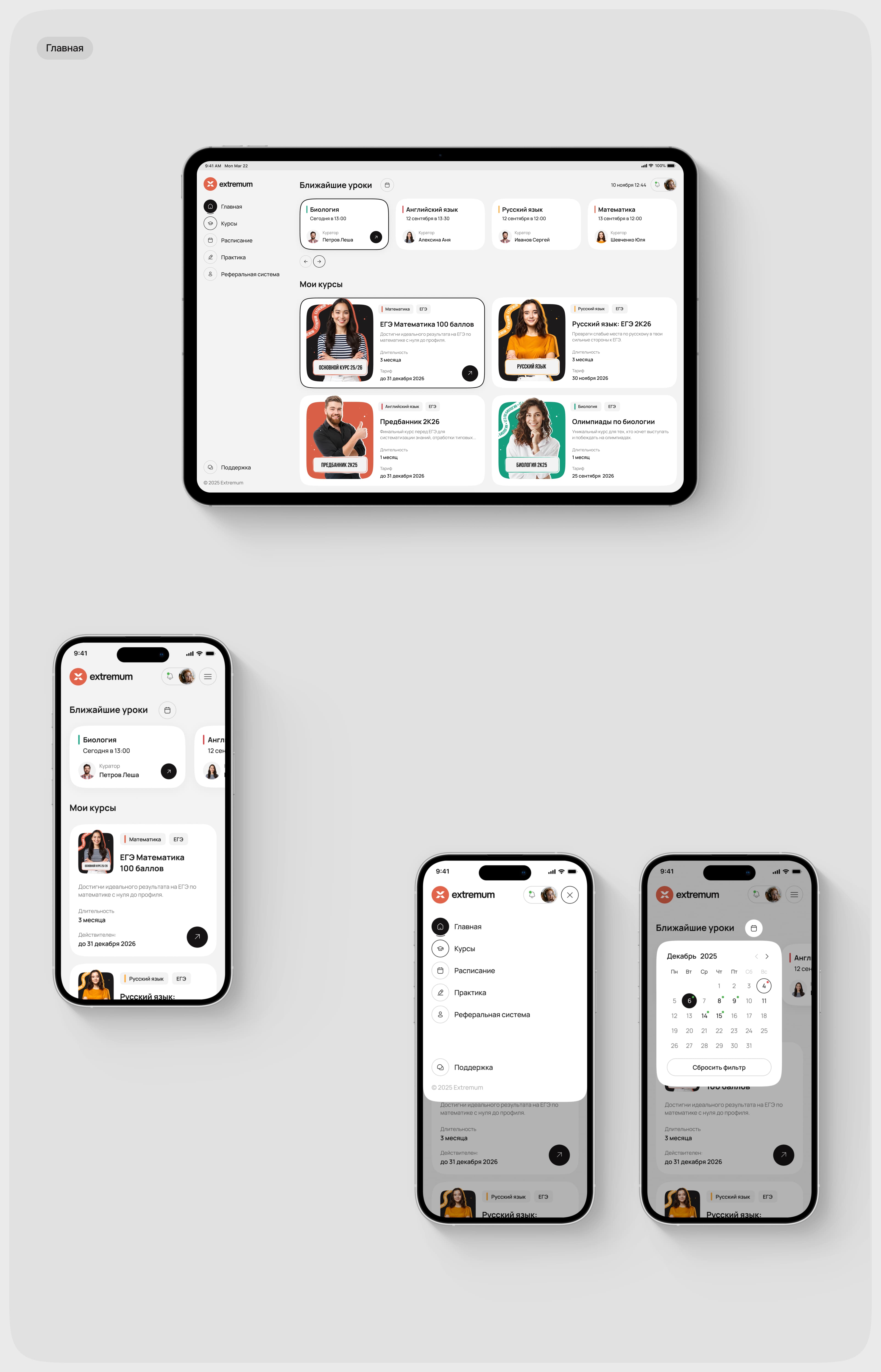
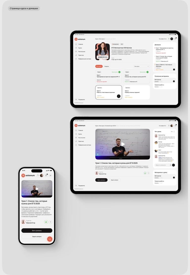
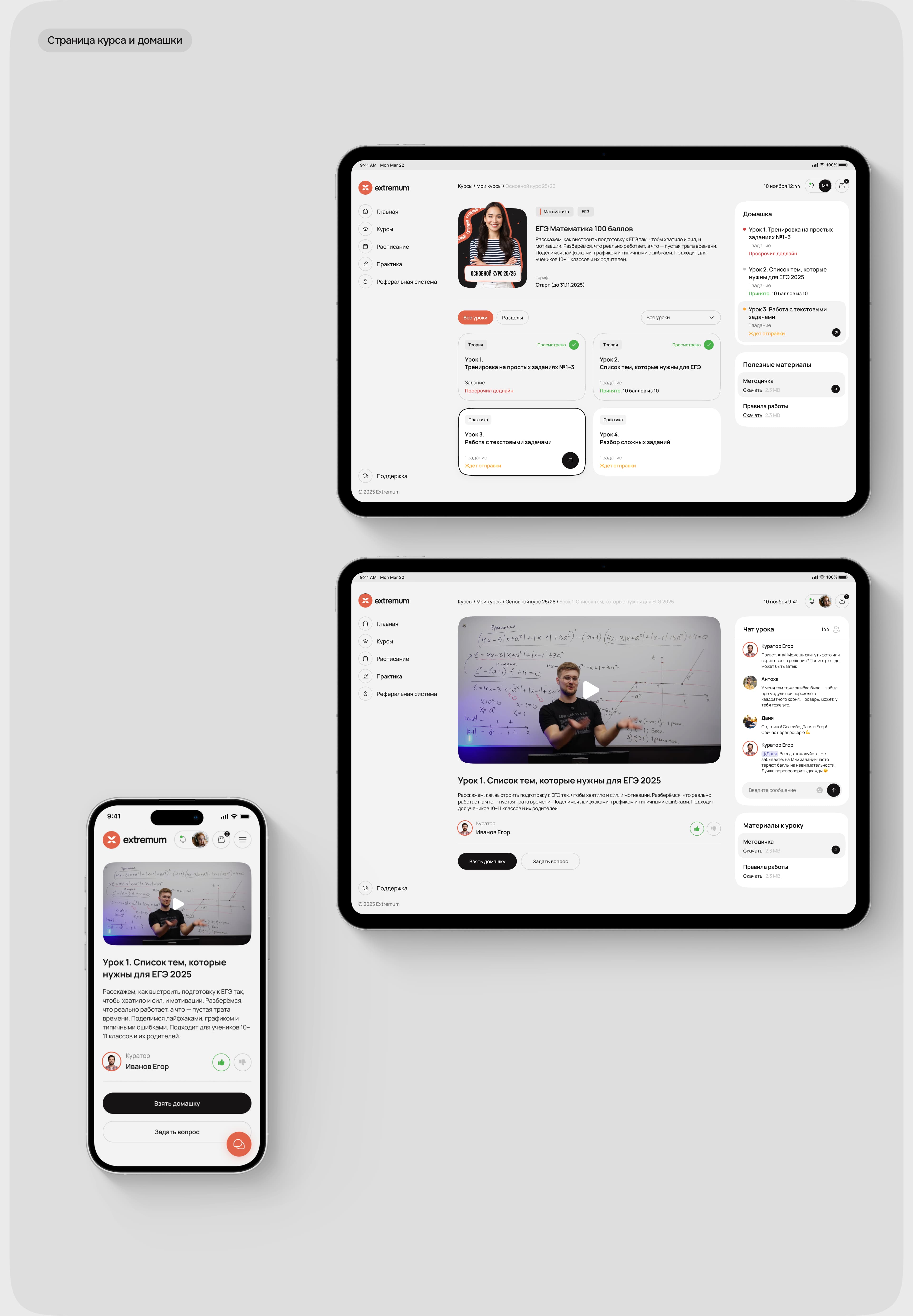
When working on the project, we started with a simple idea: exam preparation is already challenging enough, so the interface should help students stay focused rather than add more complexity.
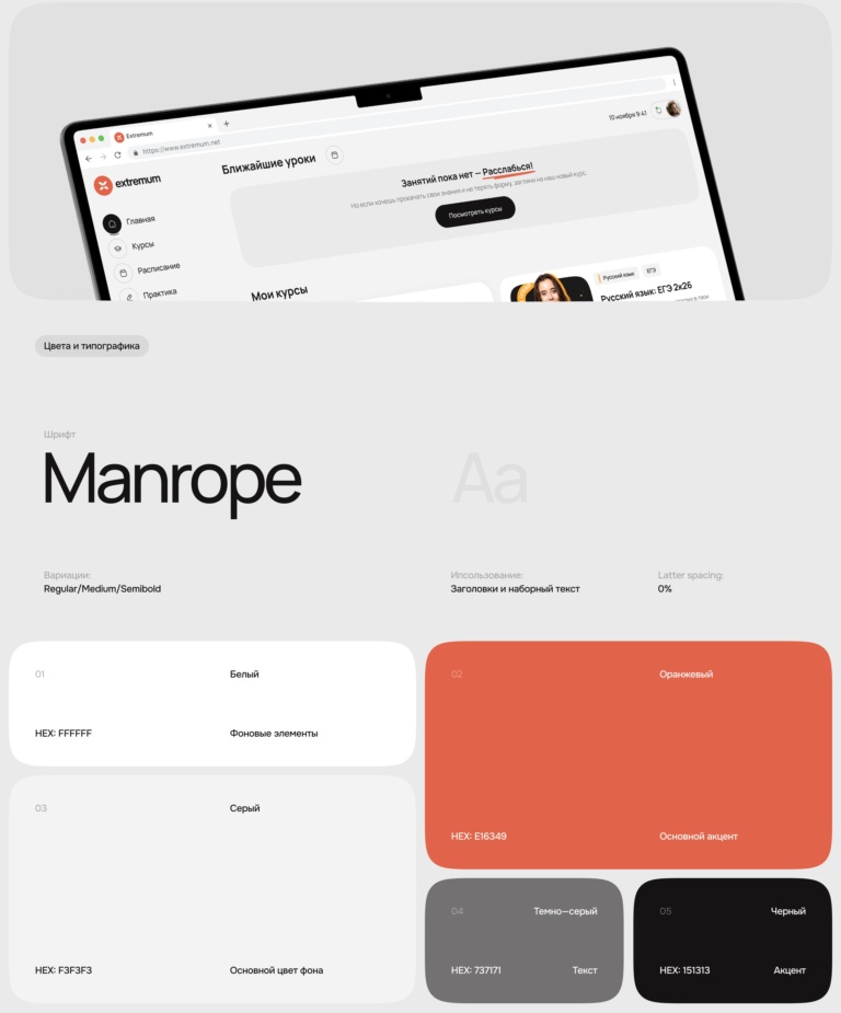
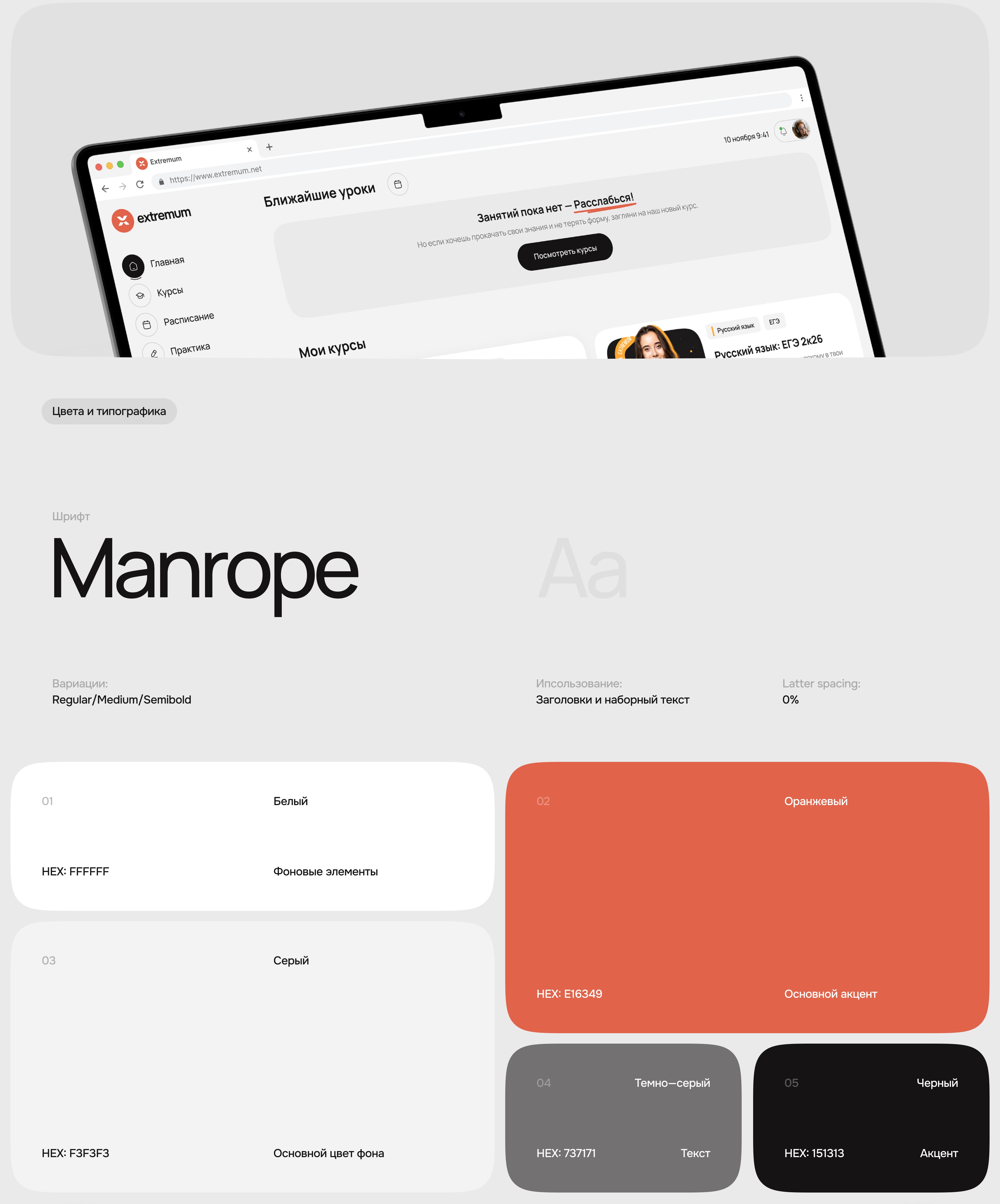
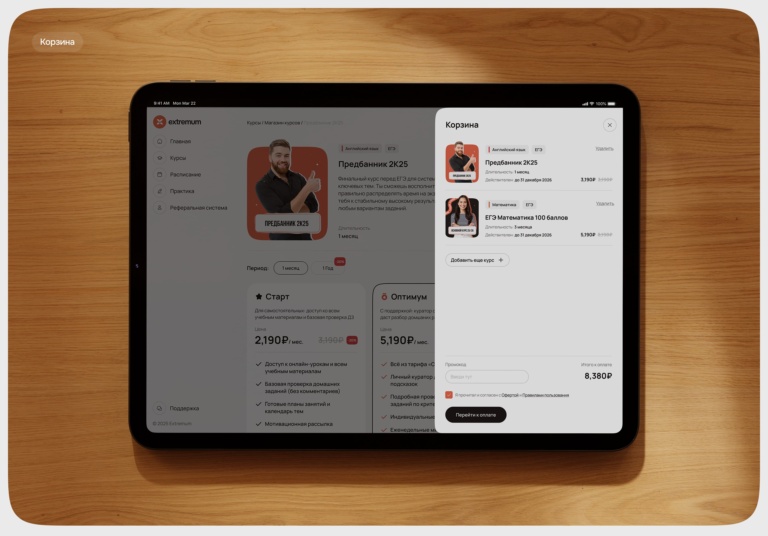
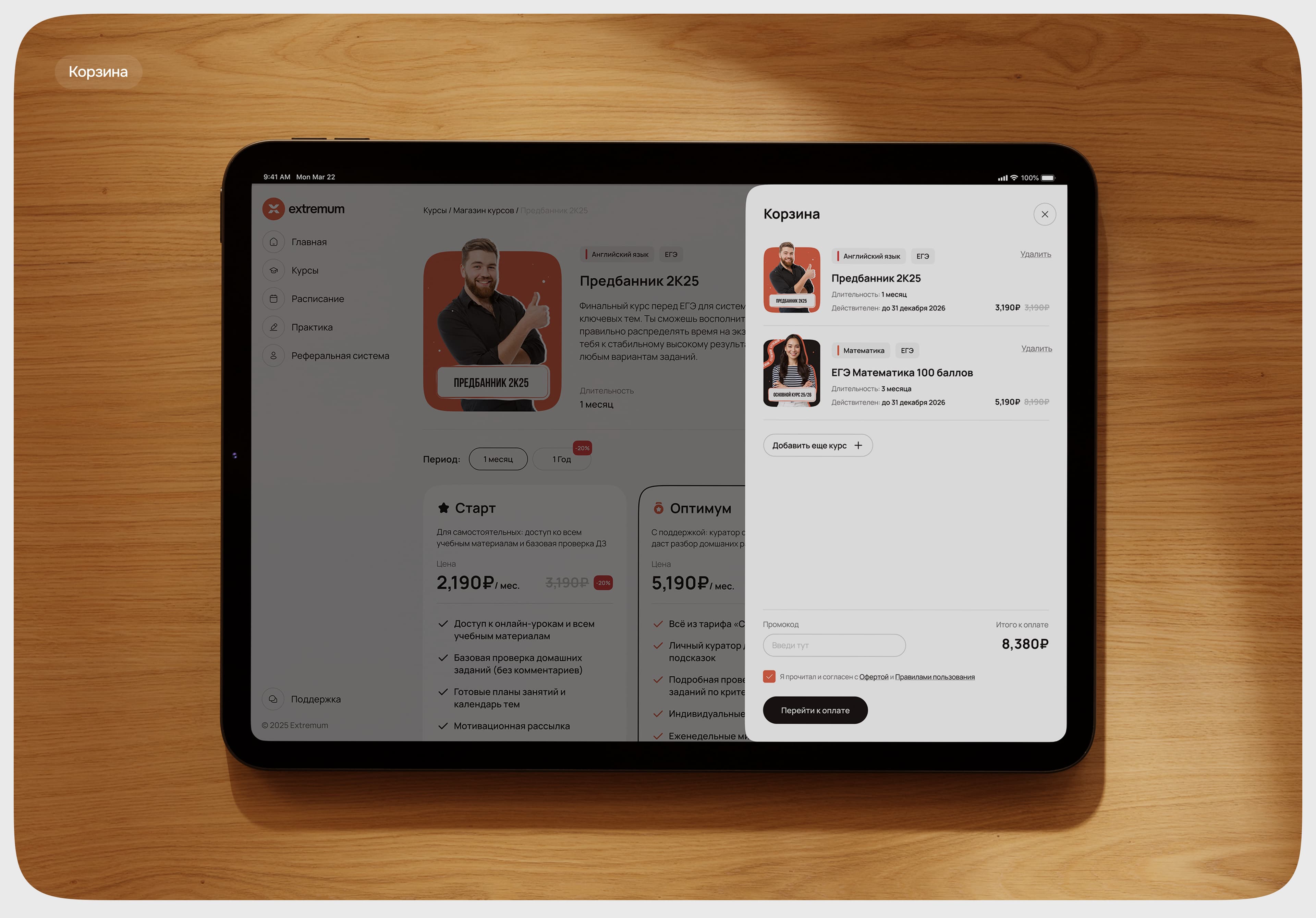
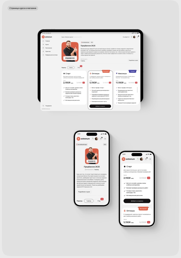
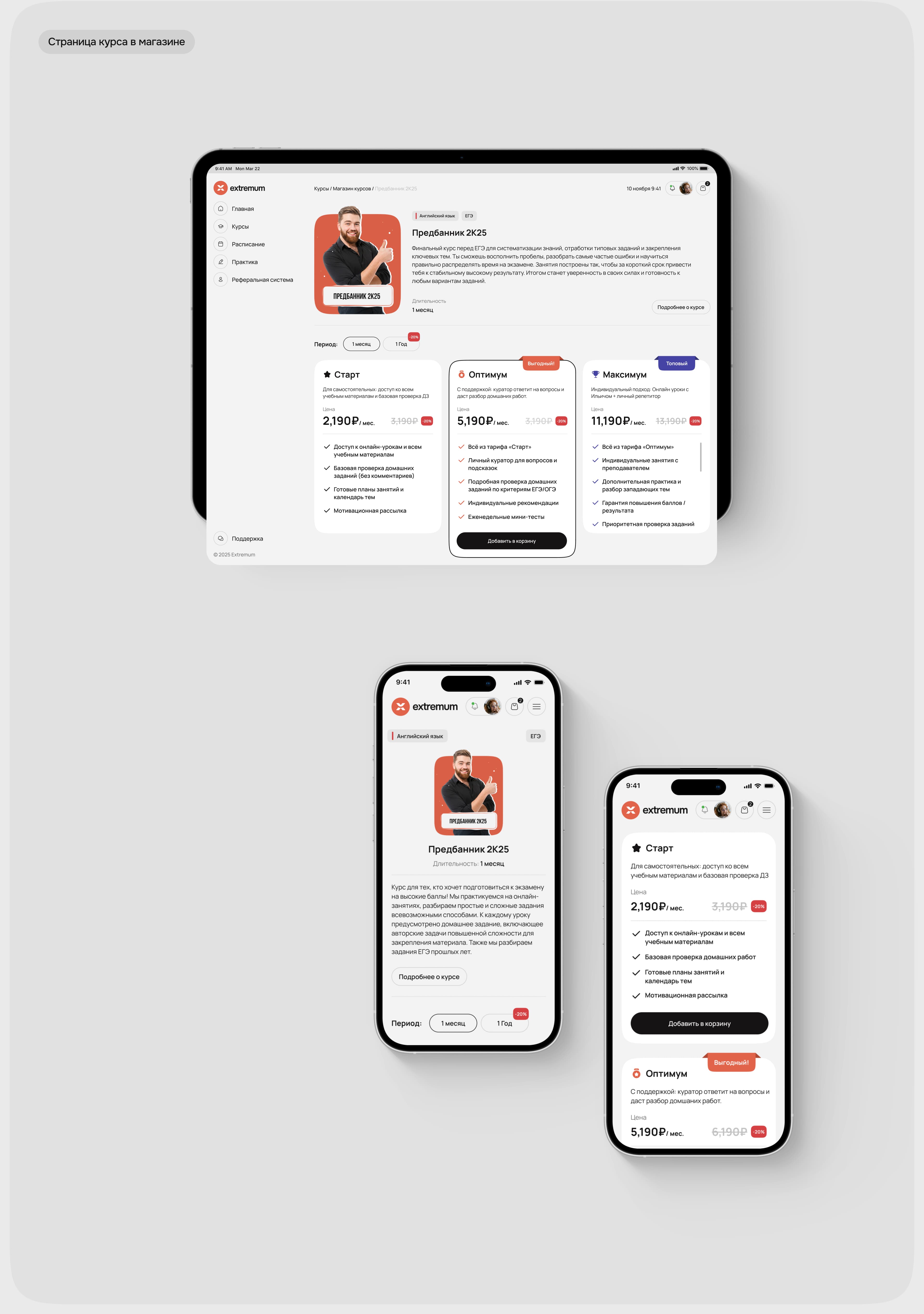
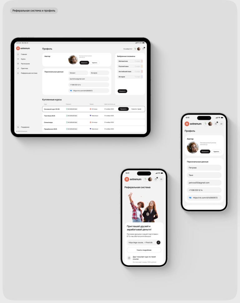
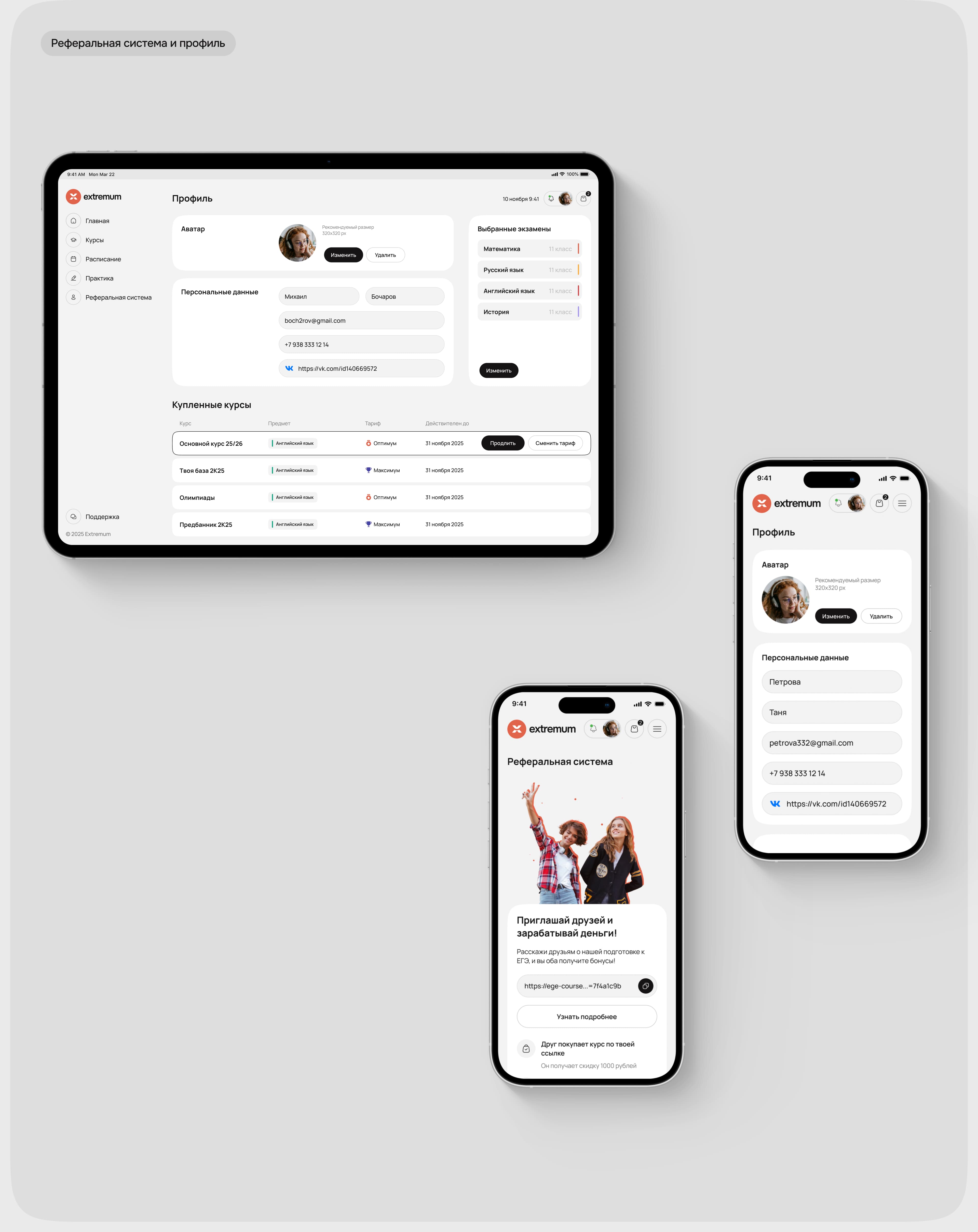
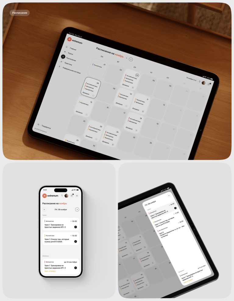
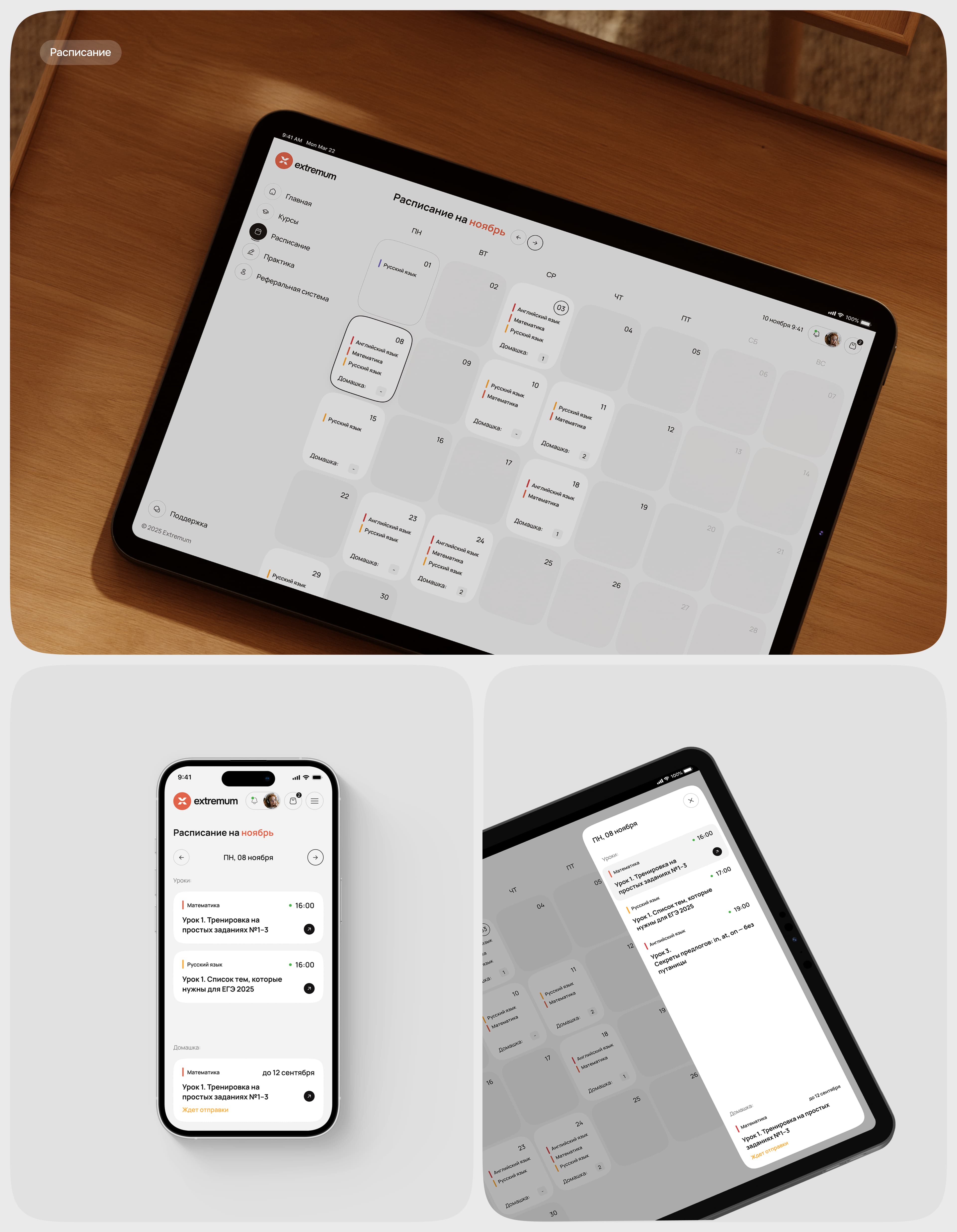
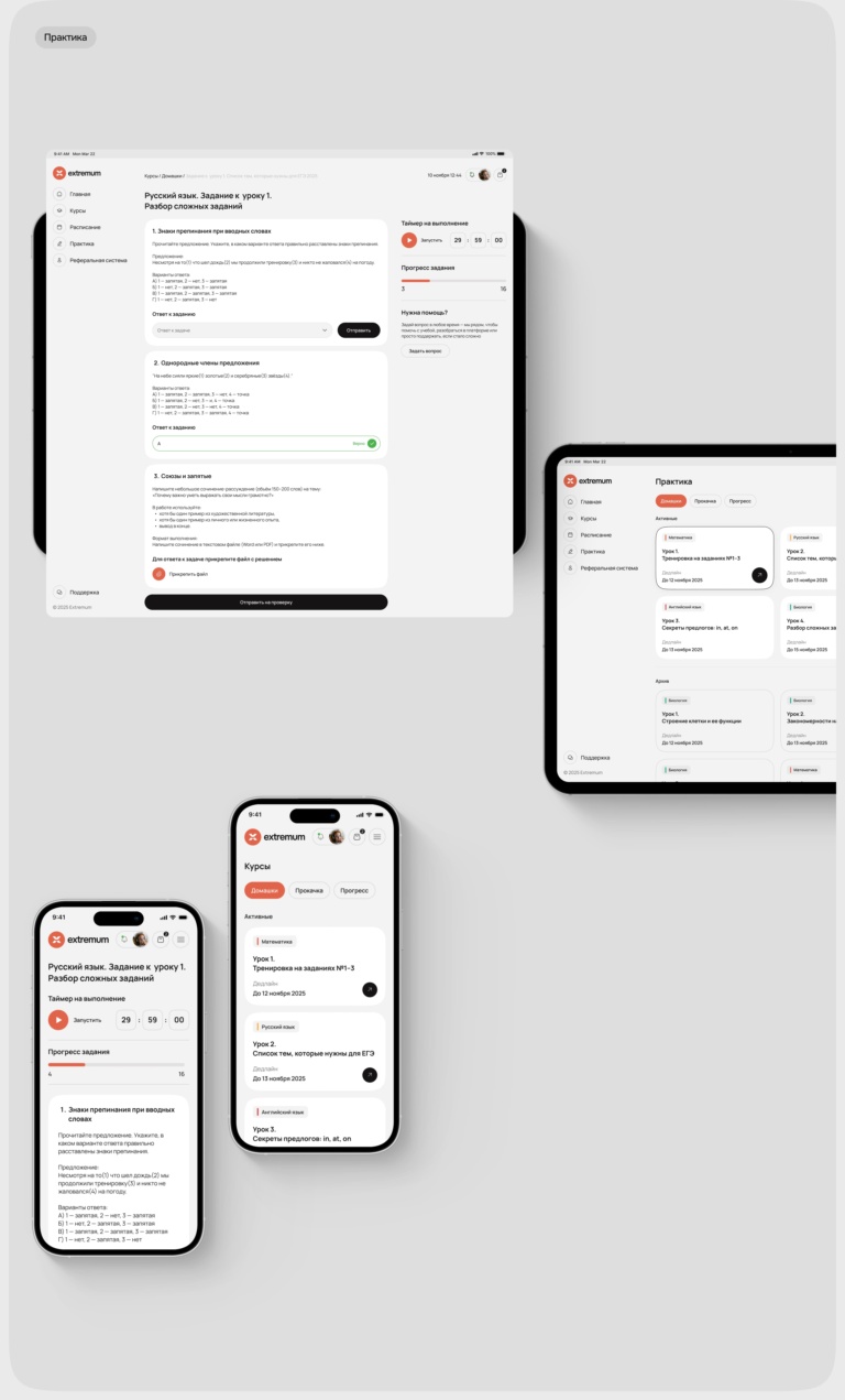
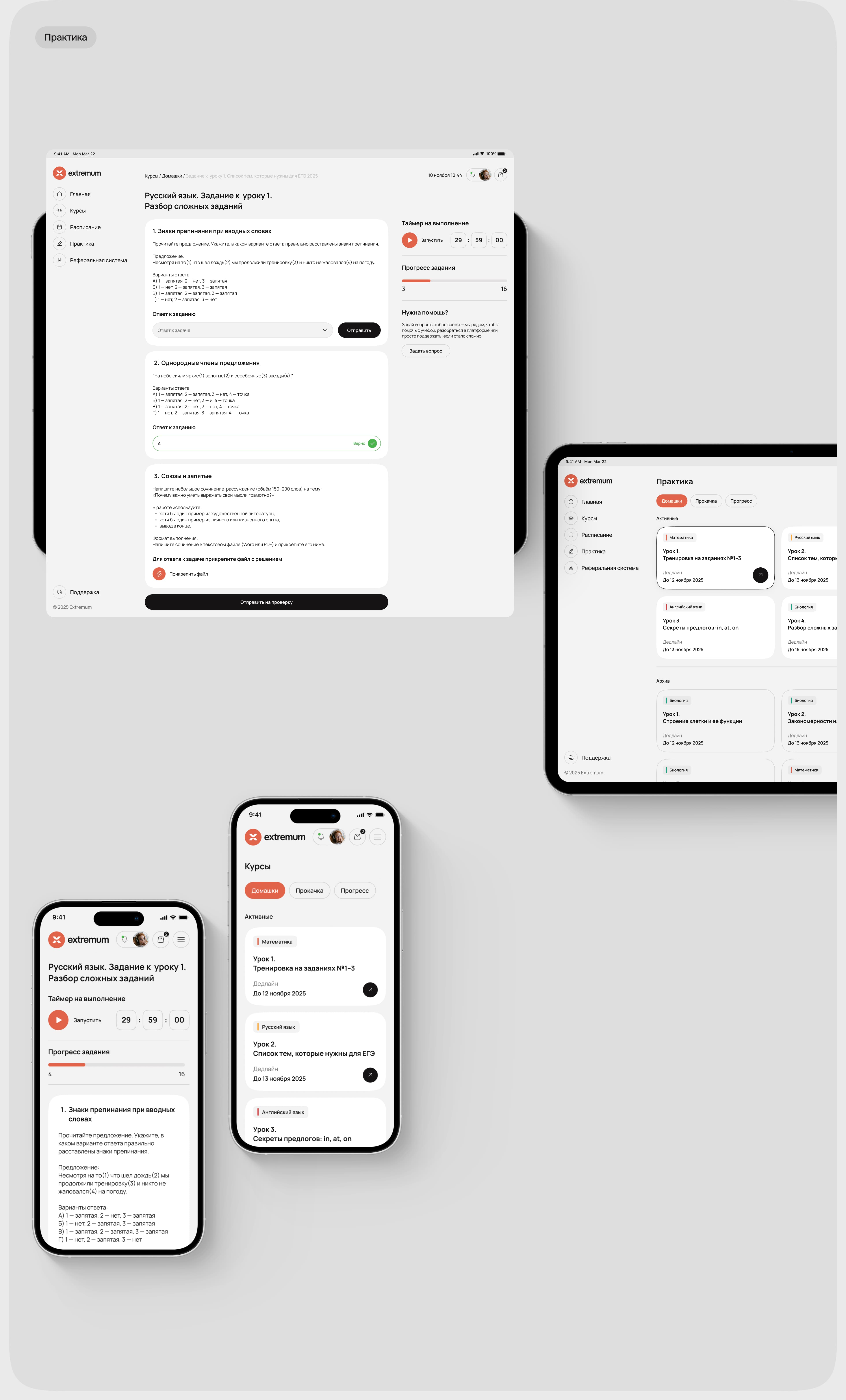
We developed the visual identity and designed a complete user journey — from choosing and purchasing a course to schedules, lessons, practice, and progress tracking. The visual system was kept light and calm, with a bright orange accent that gave the brand a more energetic character.
All key scenarios were designed for desktop, tablet, and mobile, while animation helped demonstrate how the platform works in real use.