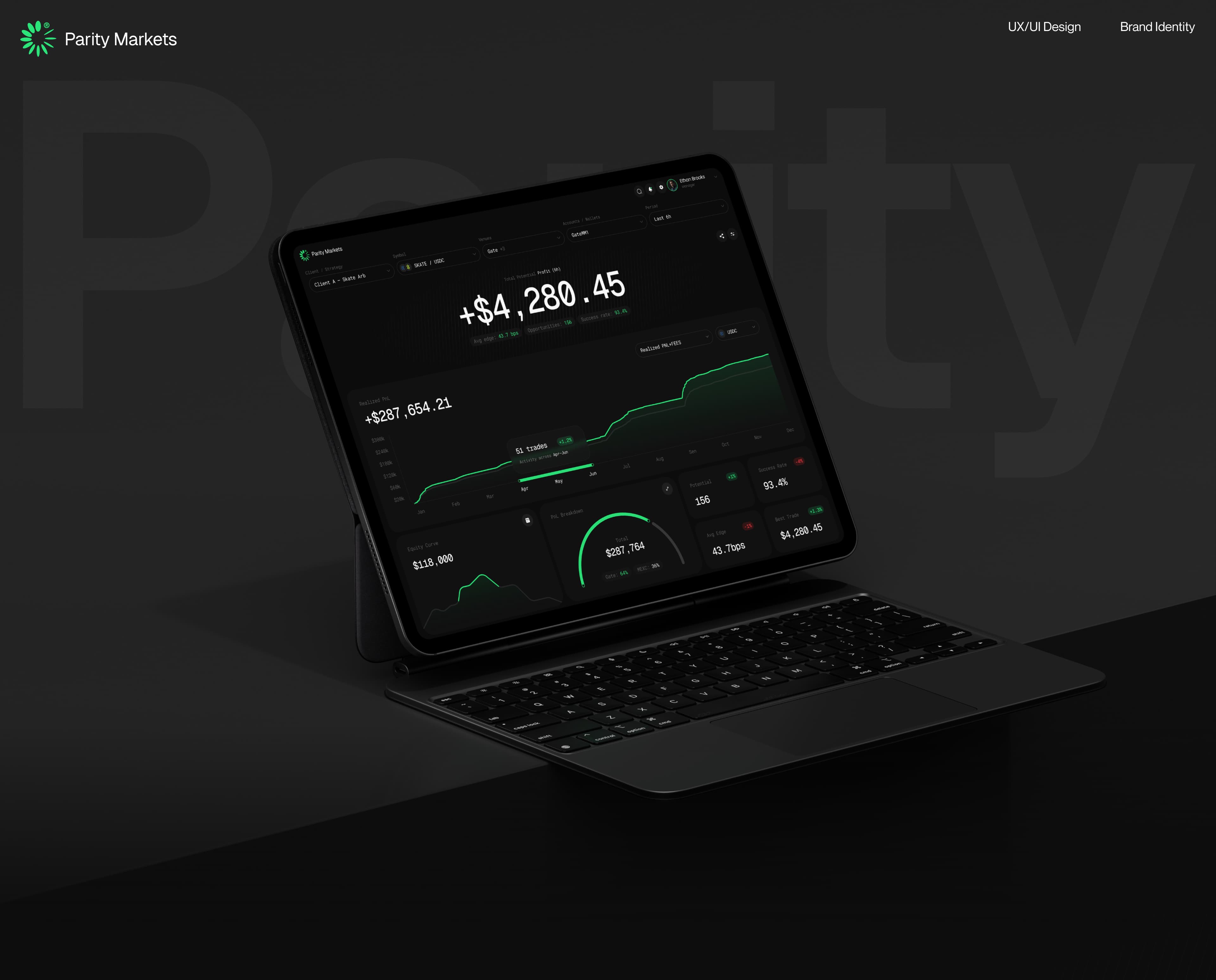
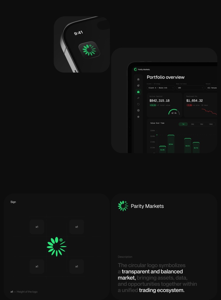
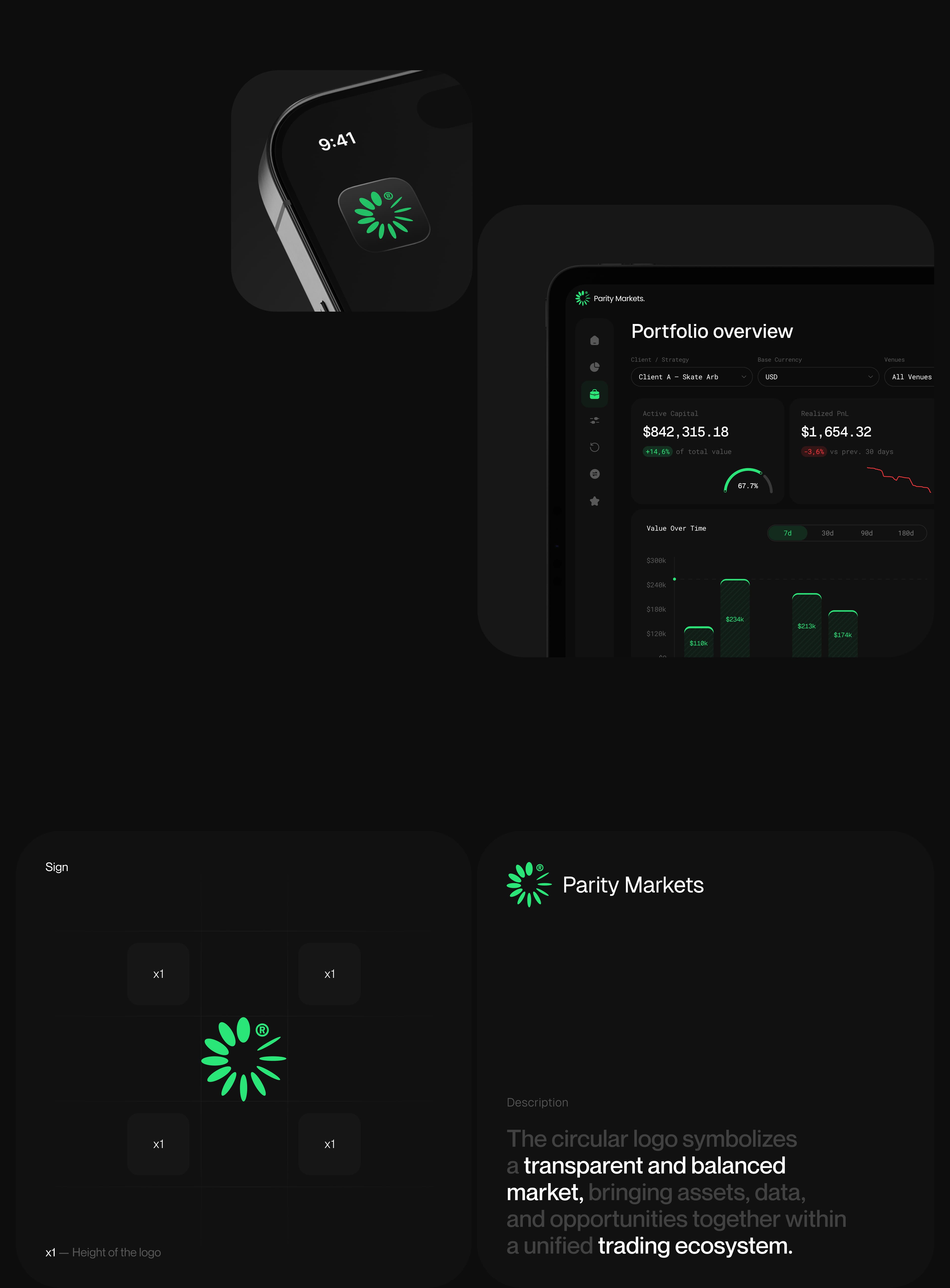
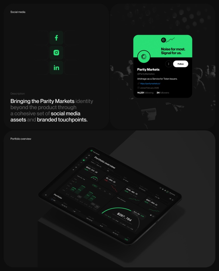
We began with the visual identity. The symbol was built around the idea of balance and a unified ecosystem connecting data, assets, and trading opportunities. This concept shaped the entire visual language: a dark foundation, a vivid green accent, typography, and graphic elements designed to work equally well within the product and beyond it.
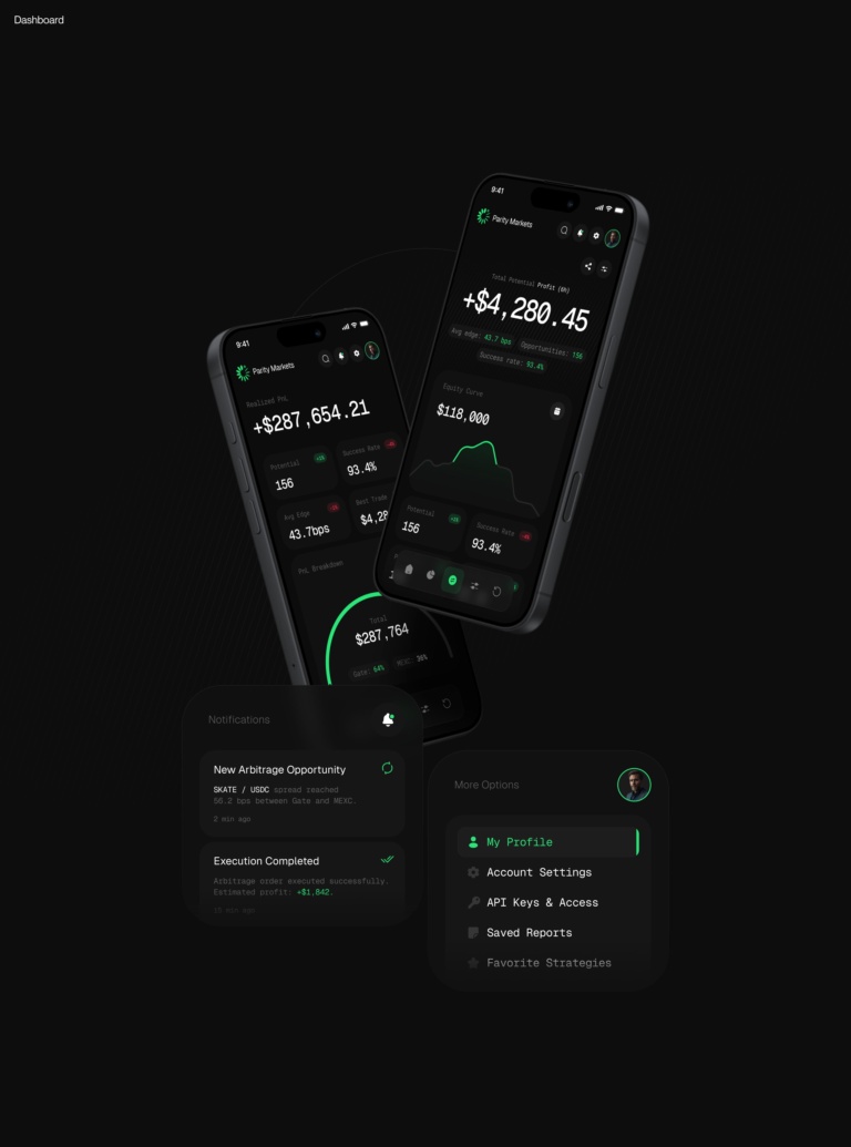
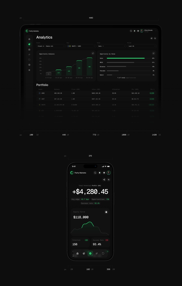
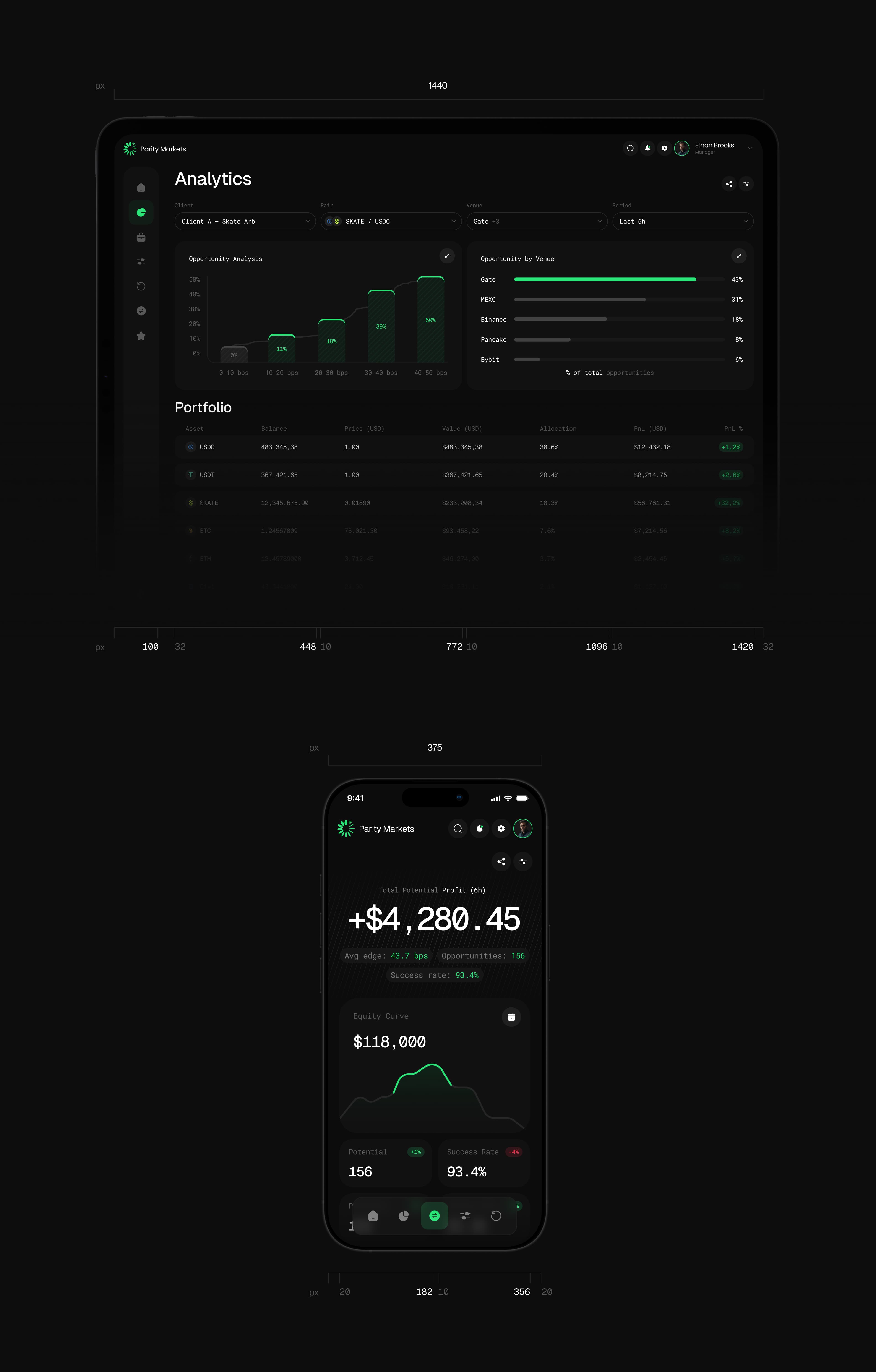
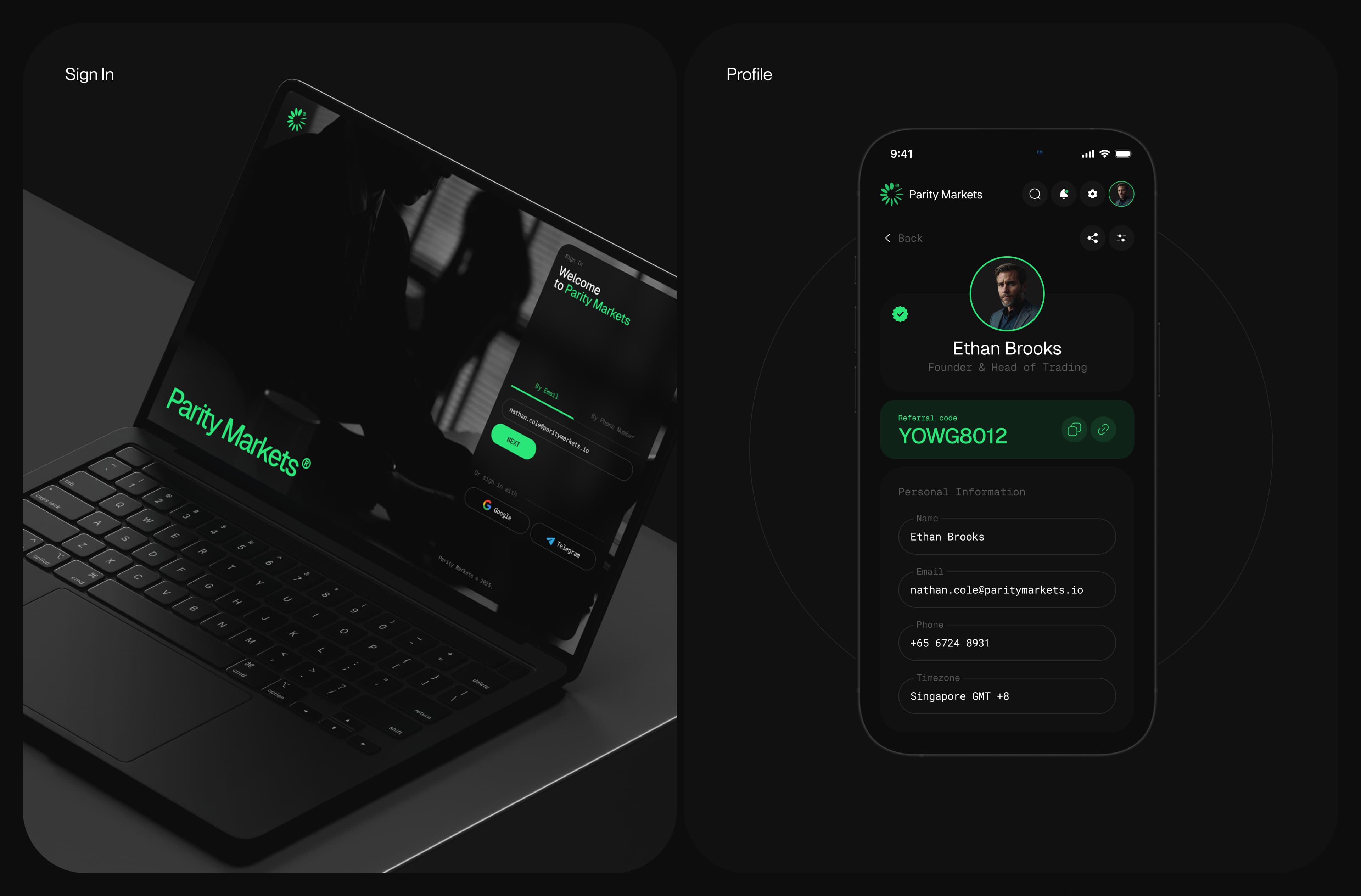
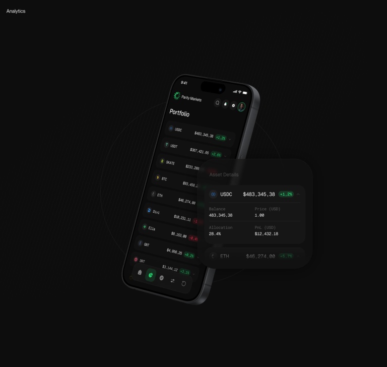
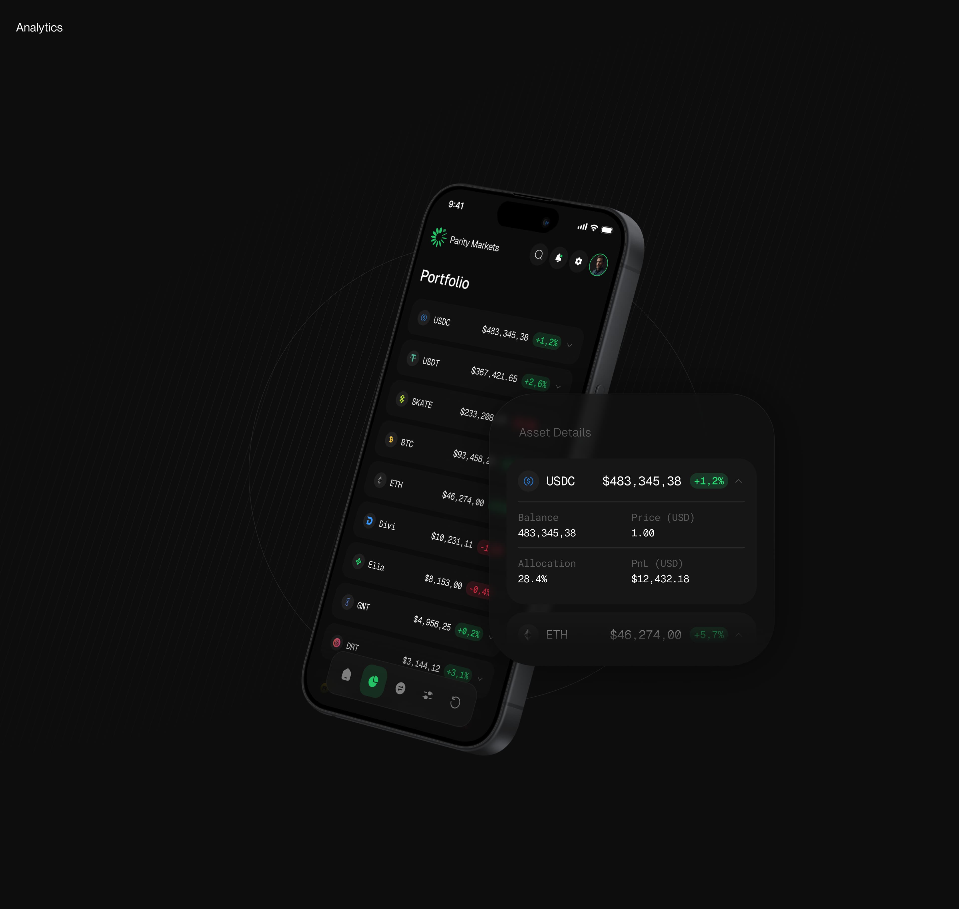
From there, the identity naturally extended into the interface. We developed the platform’s architecture and designed dashboards, analytics, portfolio management, performance reports, and trading opportunity screens, before adapting the system for mobile devices. The main challenge was to preserve a high density of information without turning the interface into visual noise, allowing users to quickly grasp what matters and take action.